Sales Design System: Fueling 8% Revenue Growth

by Trevor Probherbs
Project Overview
The Product
Thinx Inc. is a brand that specializes in period underwear, which is designed to provide an alternative to traditional menstrual hygiene products like pads and tampons.
Creating the sale design system aims to enhance revenue whenever a sale occurs, utilizing original and innovative designs across the website.
My Role
Product Designer
My Responsibility
UX/UI Design, User Research, Cross-Functional Collaboration
Tools Used
Figma
Team
Trevor Probherbs (me), Kim Suchy
Timeline
4 months
Project Goal
Design an intuitive unique design system to increase sale revenue
Solution & Impact
Created an easy-to-use, dynamic, on-brand design system that increased the company’s sale revenue by 8%.
Problem
As you may know, sales are something that occur several times throughout the year. Each sale demanded a design and over time, the visuals became repetitive bland. We wanted to create a system that is timeless and innovative that will also increase sale revenue.
Solution
We developed a more flexible and intentional approach to designing for sales on our website. This system draws together the needs of various teams to create a cohesive end-to-end user experience.
The ultimate intention is to increase sale revenue, encourage cross-brand shopping in a themed system, and to structure the collaboration between UX and Creative for an integrated visual approach to sales acorss all digital touch points.
Design Process
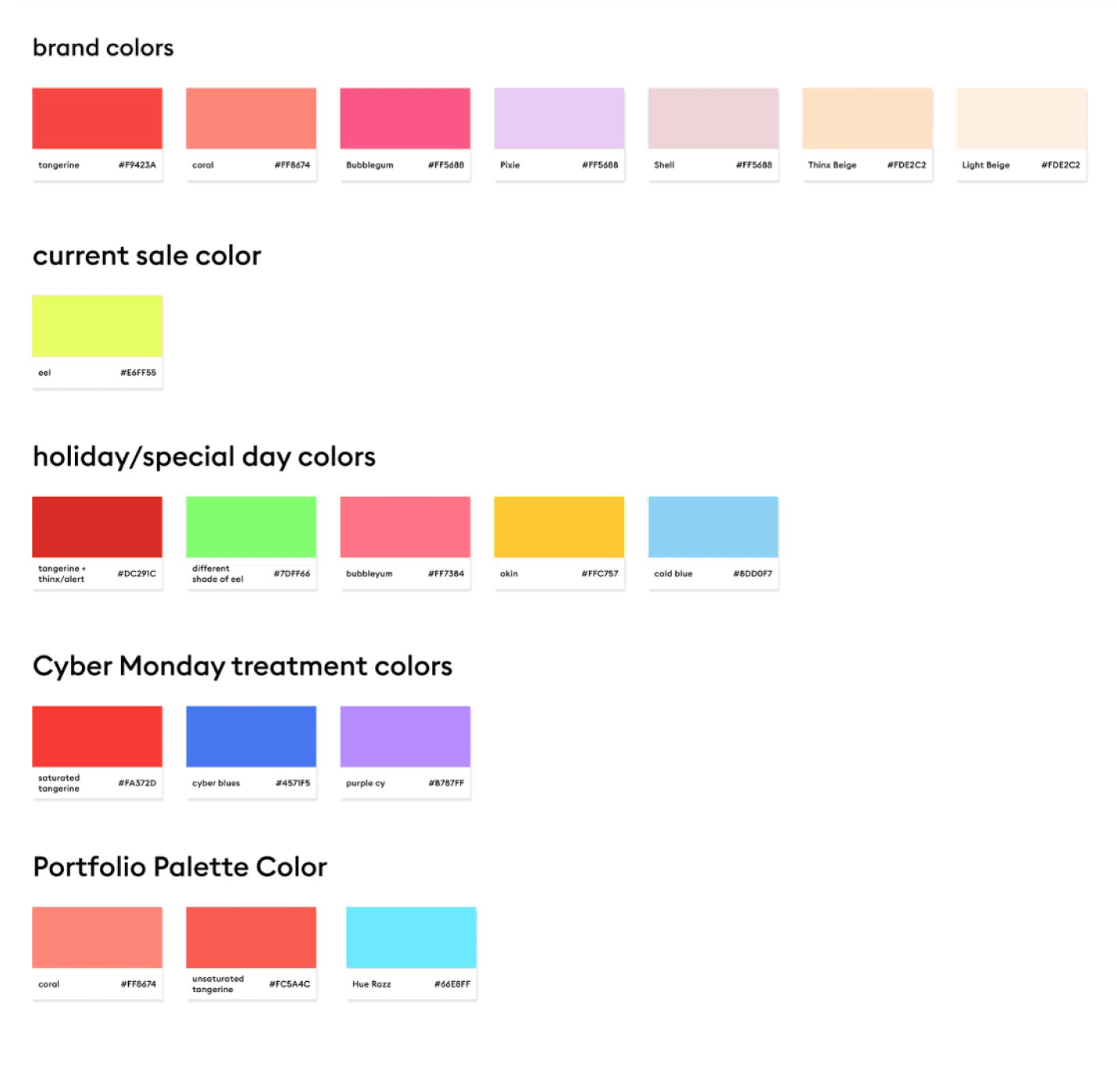
Color Exploration
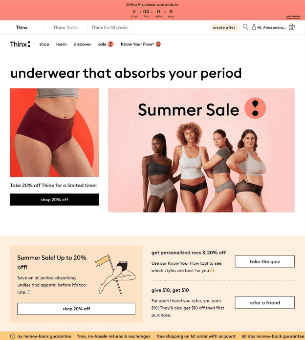
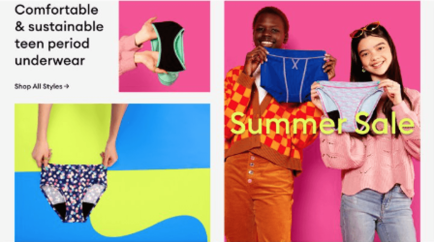
Thinx, Thinx Teens, and Thinx For All Leaks have their own brand color palettes that show up in image assets and evergreen website UI. Each sale is assigned a unique sale highlight color that will be used across all brand websites in sale-specific UI, and chosen by Creative/UX for each sale. We wanted to do a color exploration to determine what color to use as a default color if no new color is chosen.

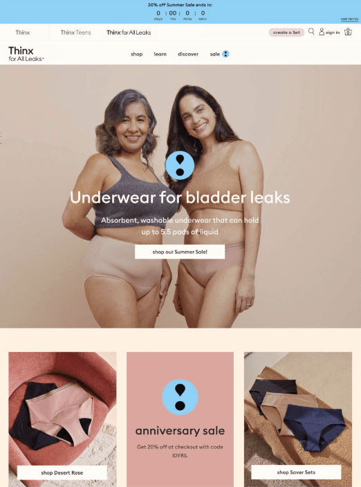
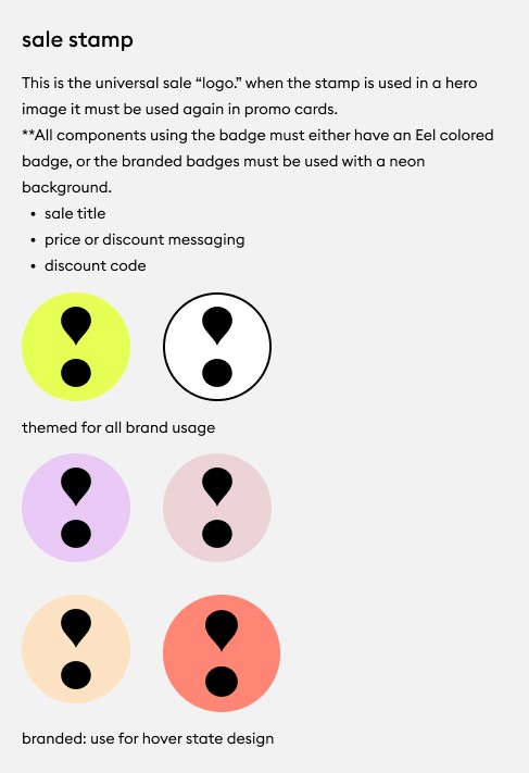
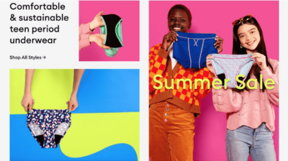
Sale Badge
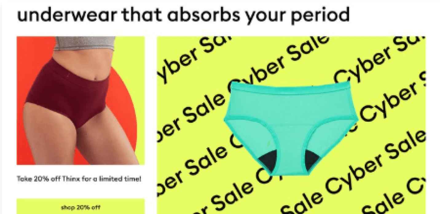
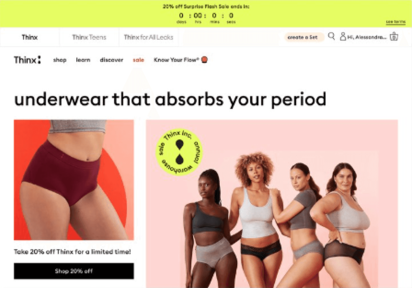
We needed a unique symbol to signal a sale, one that was distinctive to Thinx. I adapted the exclamation mark shape from the brand’s logo, linking it directly to both the brand identity and the promotion.
Above The Fold
Here are the design explorations I crafted for the landing section of each brand, capturing users' attention before they even scroll.


Footer
Check out the design concepts I’ve created for the bottom section of each brand’s page—the footer.


Design Process
Color Exploration
Thinx, Thinx Teens, and Thinx For All Leaks have their own brand color palettes that show up in image assets and evergreen website UI. Each sale is assigned a unique sale highlight color that will be used across all brand websites in sale-specific UI, and chosen by Creative/UX for each sale. We wanted to do a color exploration to determine what color to use as a default color if no new color is chosen.
Sale Badge
We needed a unique symbol to signal a sale, one that was distinctive to Thinx. I adapted the exclamation mark shape from the brand’s logo, linking it directly to both the brand identity and the promotion.
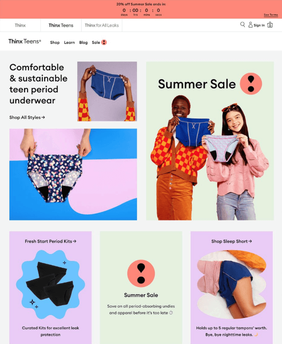
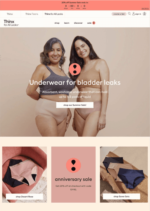
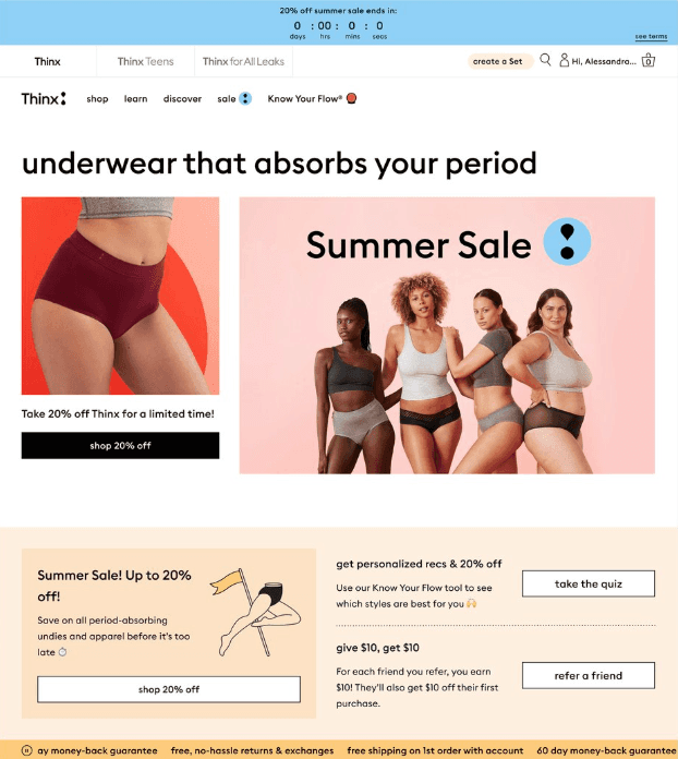
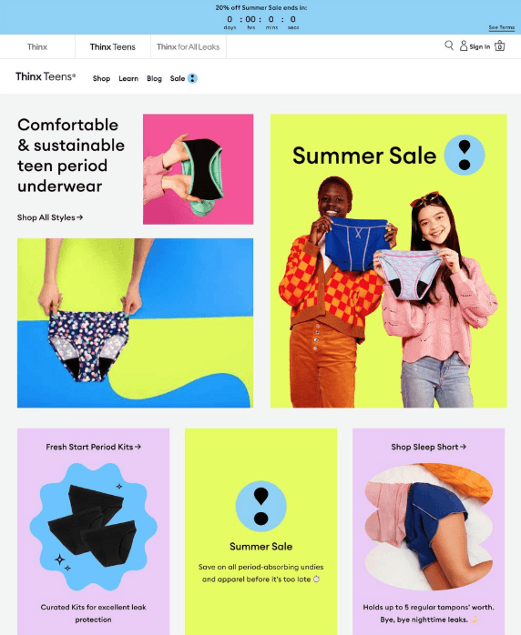
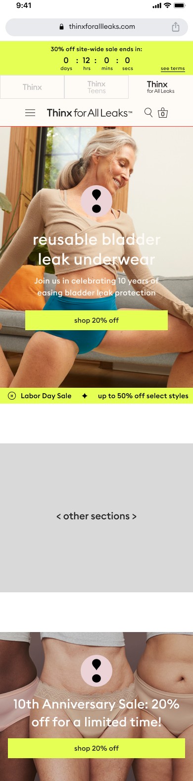
Above The Fold
Here are the design explorations I crafted for the landing section of each brand, capturing users' attention before they even scroll.
Footer
Check out the design concepts I’ve created for the bottom section of each brand’s page—the footer.
Conclusion
8% increase in sales revenue
Bridged the gap between cross-functional teams for sale promotions
Thank You For Scrolling This Far
Let’s create work together and
change lives.
Sales Design System: Fueling 8% Revenue Growth
by Trevor Probherbs
Project Overview
The Product
Thinx Inc. is a brand that specializes in period underwear, which is designed to provide an alternative to traditional menstrual hygiene products like pads and tampons.
Creating the sale design system aims to enhance revenue whenever a sale occurs, utilizing original and innovative designs across the website.
My Role
Product Designer
My Responsibility
UX/UI Design, User Research, Cross-Functional Collaboration
Tools Used
Figma
Team
Trevor Probherbs (me), Kim Suchy
Timeline
4 months
Project Goal
Design an intuitive unique design system to increase sale revenue
Solution & Impact
Created an easy-to-use, dynamic, on-brand design system that increased the company’s sale revenue by 8%.
Problem
As you may know, sales are something that occur several times throughout the year. Each sale demanded a design and over time, the visuals became repetitive bland. We wanted to create a system that is timeless and innovative that will also increase sale revenue.
Solution
We developed a more flexible and intentional approach to designing for sales on our website. This system draws together the needs of various teams to create a cohesive end-to-end user experience.
The ultimate intention is to increase sale revenue, encourage cross-brand shopping in a themed system, and to structure the collaboration between UX and Creative for an integrated visual approach to sales acorss all digital touch points.
Design Process
Color Exploration
Thinx, Thinx Teens, and Thinx For All Leaks have their own brand color palettes that show up in image assets and evergreen website UI. Each sale is assigned a unique sale highlight color that will be used across all brand websites in sale-specific UI, and chosen by Creative/UX for each sale. We wanted to do a color exploration to determine what color to use as a default color if no new color is chosen.

Sale Badge
We needed a unique symbol to signal a sale, one that was distinctive to Thinx. I adapted the exclamation mark shape from the brand’s logo, linking it directly to both the brand identity and the promotion.
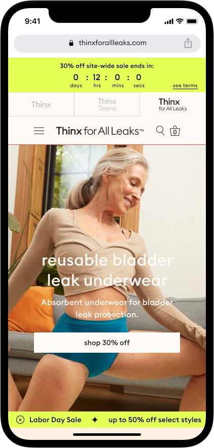
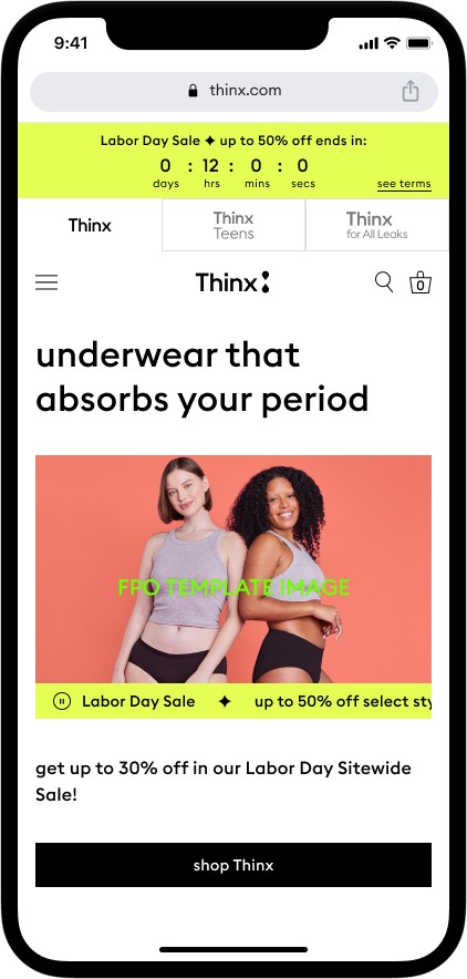
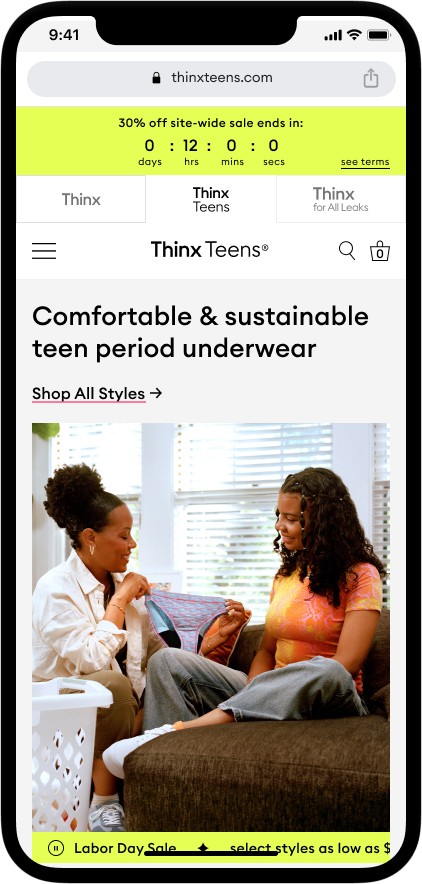
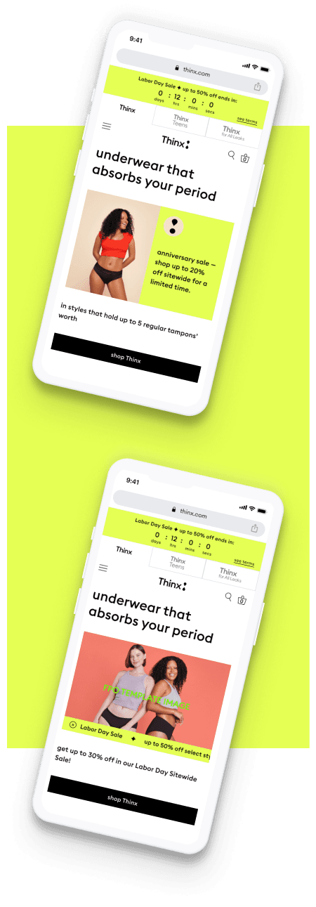
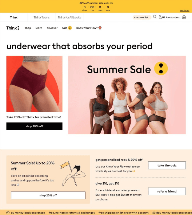
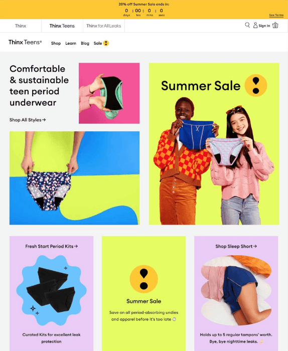
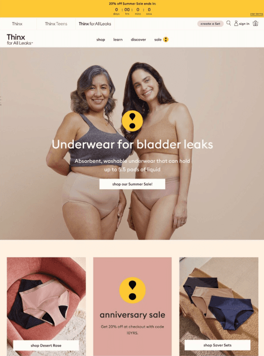
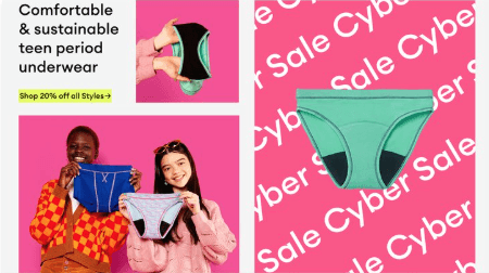
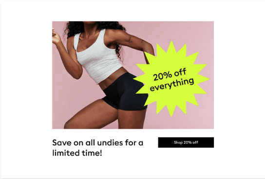
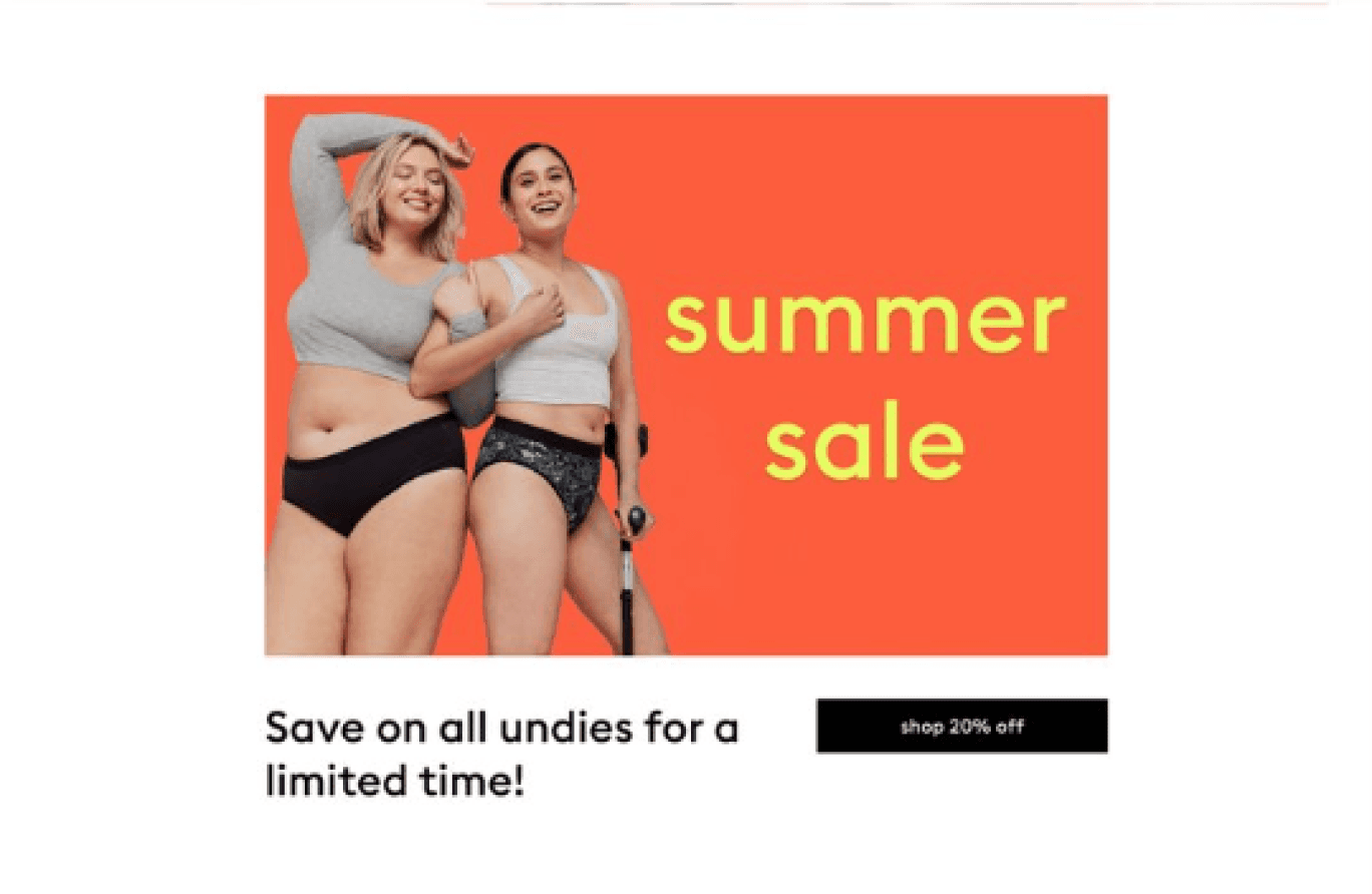
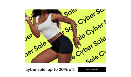
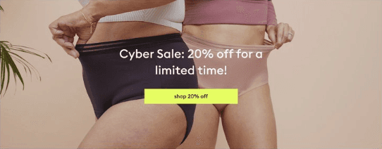
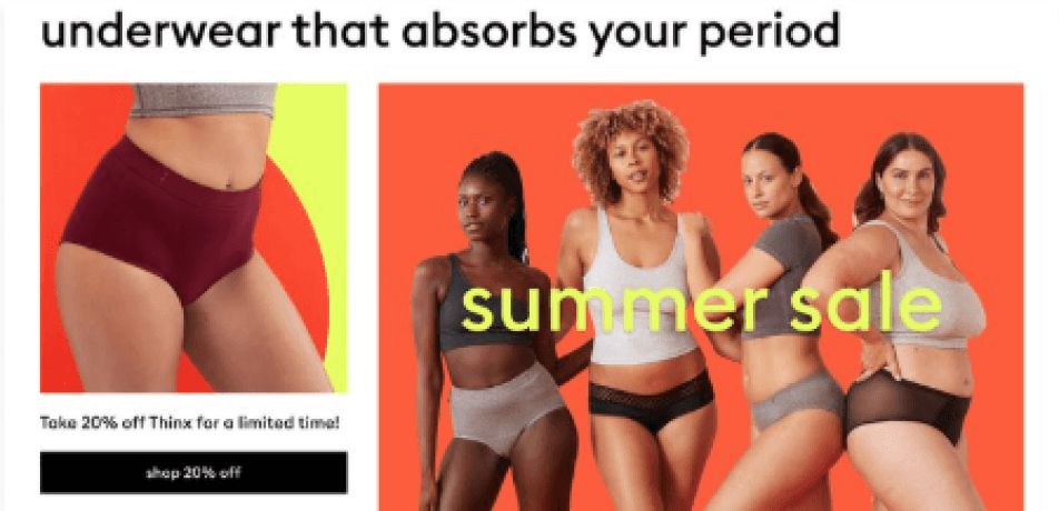
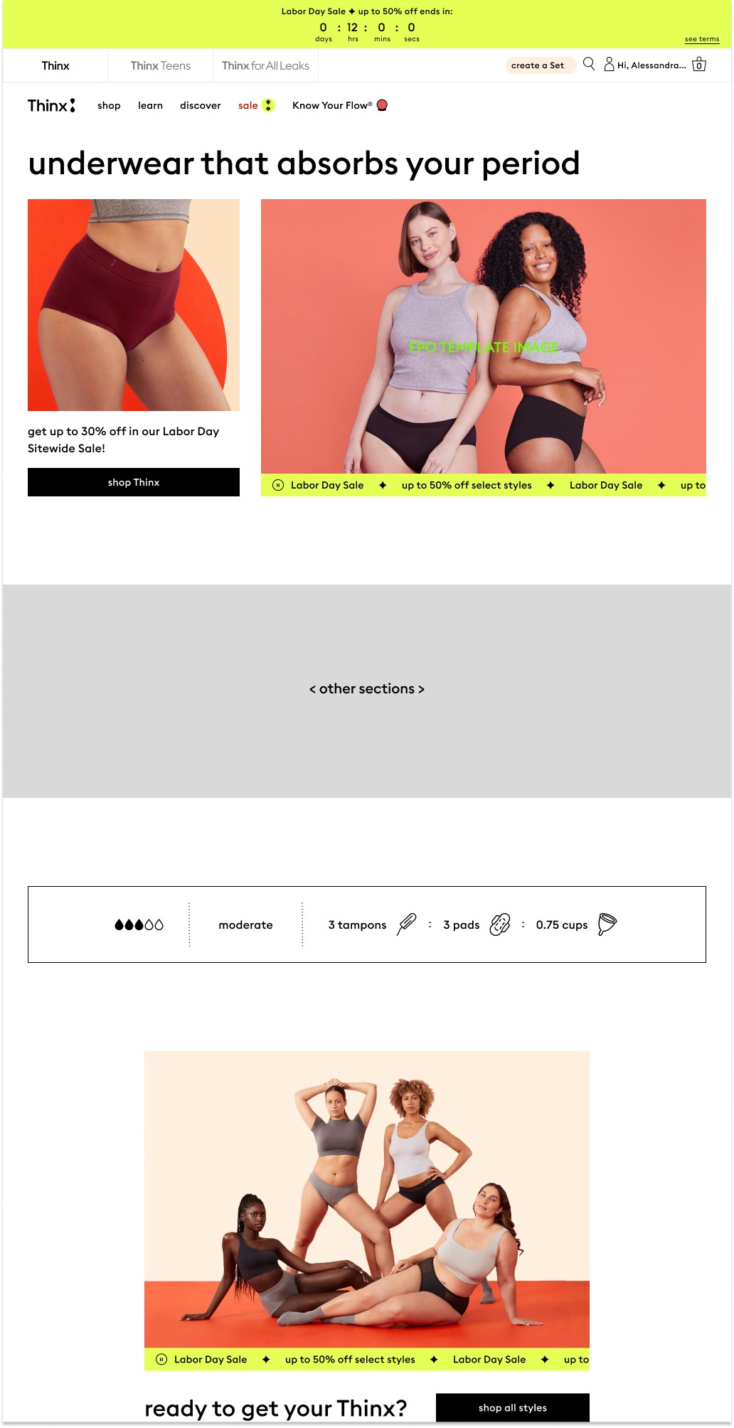
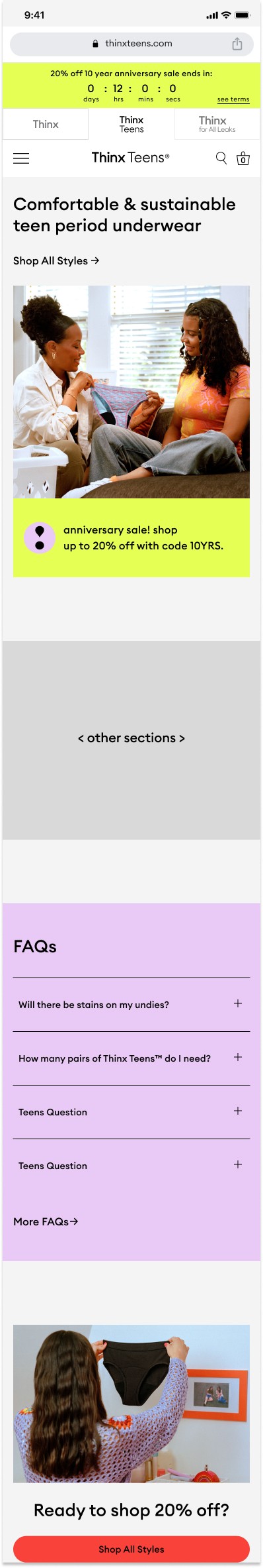
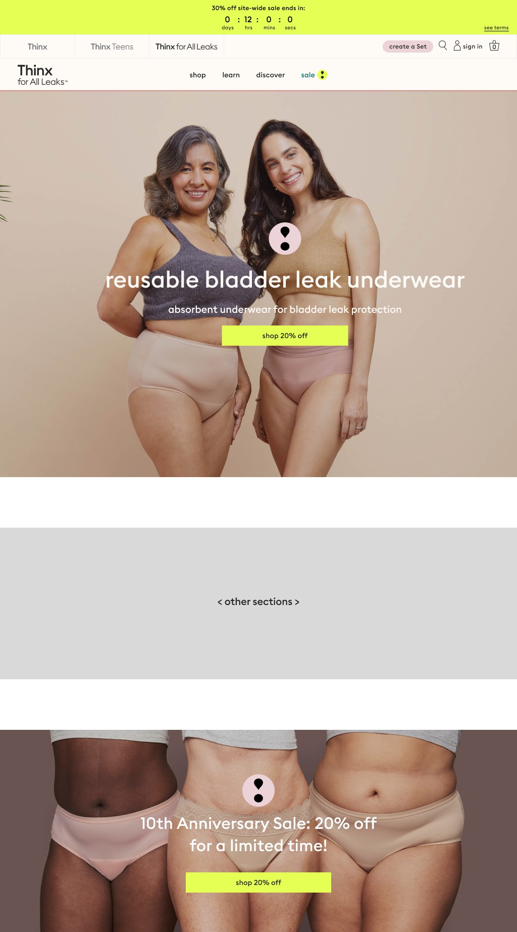
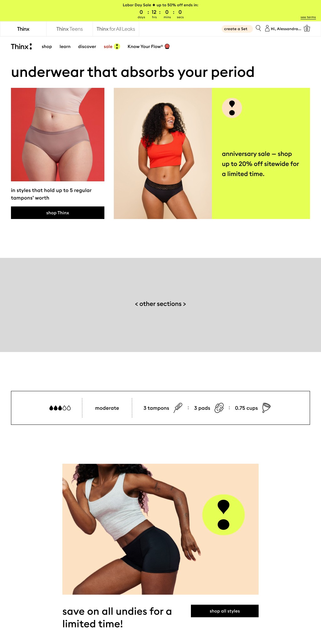
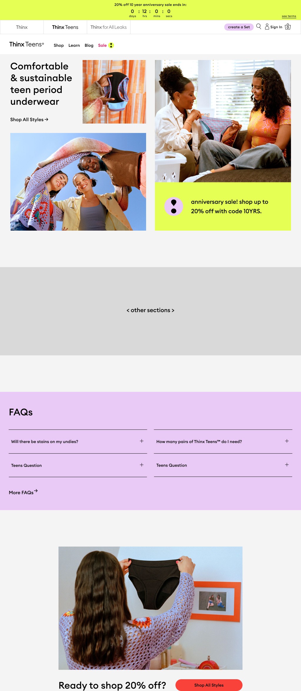
Above The Fold
Here are the design explorations I crafted for the landing section of each brand, capturing users' attention before they even scroll.


Footer
Check out the design concepts I’ve created for the bottom section of each brand’s page—the footer.

Design Process
Color Exploration
Thinx, Thinx Teens, and Thinx For All Leaks have their own brand color palettes that show up in image assets and evergreen website UI. Each sale is assigned a unique sale highlight color that will be used across all brand websites in sale-specific UI, and chosen by Creative/UX for each sale. We wanted to do a color exploration to determine what color to use as a default color if no new color is chosen.
Sale Badge
We needed a unique symbol to signal a sale, one that was distinctive to Thinx. I adapted the exclamation mark shape from the brand’s logo, linking it directly to both the brand identity and the promotion.
Above The Fold
Here are the design explorations I crafted for the landing section of each brand, capturing users' attention before they even scroll.
Footer
Check out the design concepts I’ve created for the bottom section of each brand’s page—the footer.
Conclusion
8% increase in sales revenue
Bridged the gap between cross-functional teams for sale promotions
Thank You For Scrolling This Far
Let’s create work together and
change lives.
Sales Design System: Fueling 8% Revenue Growth
by Trevor Probherbs
Project Overview
The Product
Thinx Inc. is a brand that specializes in period underwear, which is designed to provide an alternative to traditional menstrual hygiene products like pads and tampons.
Creating the sale design system aims to enhance revenue whenever a sale occurs, utilizing original and innovative designs across the website.
My Role
Product Designer
My Responsibility
UX/UI Design, User Research, Cross-Functional Collaboration
Tools Used
Figma
Team
Trevor Probherbs (me), Kim Suchy
Timeline
4 months
Project Goal
Design an intuitive unique design system to increase sale revenue
Solution & Impact
Created an easy-to-use, dynamic, on-brand design system that increased the company’s sale revenue by 8%.
Problem
As you may know, sales are something that occur several times throughout the year. Each sale demanded a design and over time, the visuals became repetitive bland. We wanted to create a system that is timeless and innovative that will also increase sale revenue.
Solution
We developed a more flexible and intentional approach to designing for sales on our website. This system draws together the needs of various teams to create a cohesive end-to-end user experience.
The ultimate intention is to increase sale revenue, encourage cross-brand shopping in a themed system, and to structure the collaboration between UX and Creative for an integrated visual approach to sales acorss all digital touch points.
Design Process
Color Exploration
Thinx, Thinx Teens, and Thinx For All Leaks have their own brand color palettes that show up in image assets and evergreen website UI. Each sale is assigned a unique sale highlight color that will be used across all brand websites in sale-specific UI, and chosen by Creative/UX for each sale. We wanted to do a color exploration to determine what color to use as a default color if no new color is chosen.
Sale Badge
We needed a unique symbol to signal a sale, one that was distinctive to Thinx. I adapted the exclamation mark shape from the brand’s logo, linking it directly to both the brand identity and the promotion.
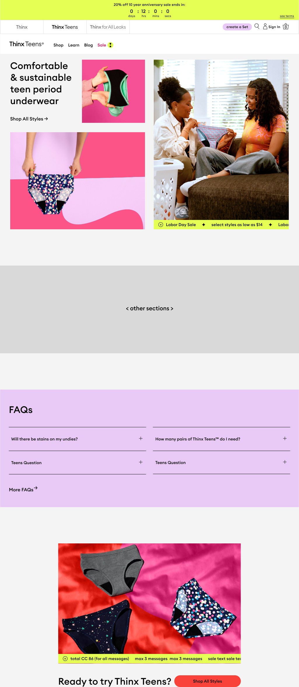
Above The Fold
Here are the design explorations I crafted for the landing section of each brand, capturing users' attention before they even scroll.

Footer
Check out the design concepts I’ve created for the bottom section of each brand’s page—the footer.


Templates
To streamline future sales promotions, we’ve designed a variety of templates for both the Creative and UX teams to pick from.
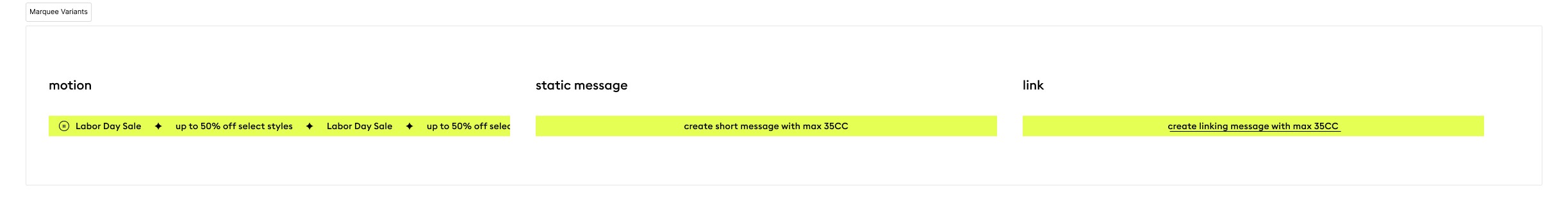
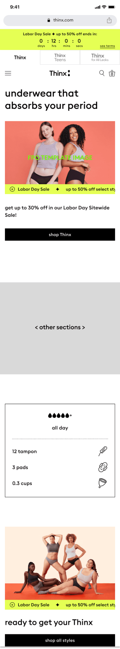
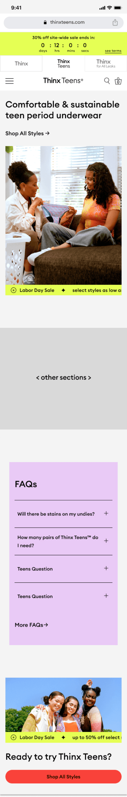
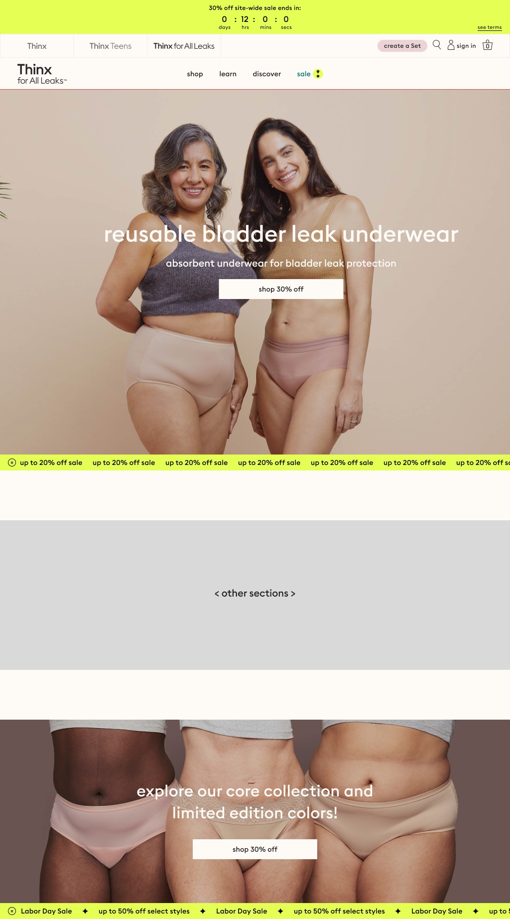
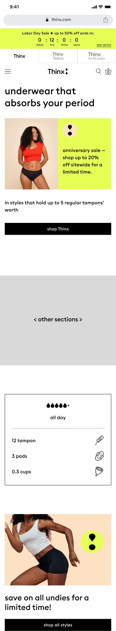
Marquee Template
In this template, sale messaging is displayed in a marquee that is sticky to the bottom of the primary hero image and the shop all promo section for all 3 brand homepages
The marquee can hold:
motion: up to 3 messages that will scroll horizontally
a single static message
a single message that links
Mobile Layouts

Desktop Layouts
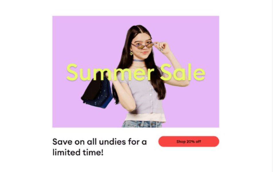
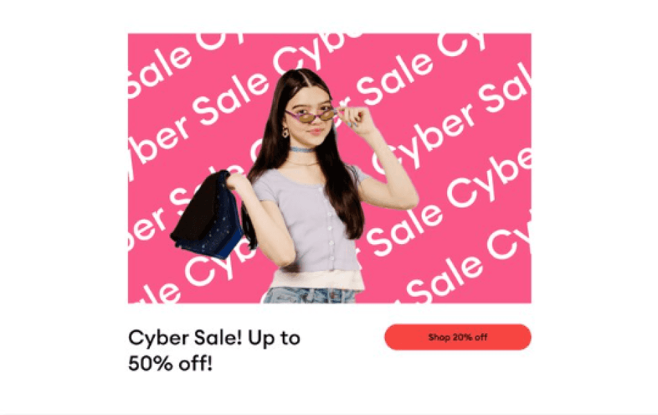
Just My Type
This template leverages sale messaging with a hero that combines product image, live text, and the sale badge. Easily A/B test copy and build a cross-brand shop experience with a prominent highlight color and sale badge that appears across all brand homepages. Thinx and Thinx Teens heroes offer an easter egg hover state on desktop screens and linking text on all breakpoints.
Mobile Layouts
Desktop Layouts
Conclusion
8% increase in sales revenue
Bridged the gap between cross-functional teams for sale promotions
Thank You For Scrolling This Far
Let’s create work together and
change lives.